Wednesday, 25 May 2011

Project two - complete!


This is what my final Illustrator file looks like. It will be cut in a few weeks, leaving me with an A2 sized paper cut out.

I plan on presenting it by hanging it, using pins and string. I'll spray paint it black and use black string (the walls will be white). I plan on pinning the string from the drawing to the wall out on angles, like an extension of the drawing.

Monday, 23 May 2011

Creating a line drawing in Photoshop.


Here is what I have so far. I've taken my drawing and put it into Photoshop where I'm editing it. I'm connecting any broken lines so that the final product - a piece of laser-cut paper - doesn't fall apart. I've made it all black and white and thickened the lines too. I'm going to keep working on it, smoothing out bits here and there until it's ready to put into Illustrator.

Saturday, 14 May 2011

Working on project 2.

I have decided on an idea and now it's time to start producing it.
Here is a sketch:


I want to try to focus on linework, like Risa Fukui.
I've scanned my tracing/drawing into photoshop where I will edit it, then convert it into an Illustrator file ready to be laser cut.

Wednesday, 11 May 2011

Risa Fukui.

Risa Fukui is a Japanese artist. I posted one of her images before but decided to look further into her work:


She creates amazing line drawings, and paper cut outs too:


Faces.

So I've decided to change my idea - the vine leaves idea wasn't really going to work. I've decided to make something involving faces. A bit like Amie Dicke or Risa Fukui. I'll start by tracing some magazine images and create some line drawings...

Tuesday, 10 May 2011

Working on my idea.

I'm currently considering how I would create a leaf or vine-like paper work.
I have two main considerations:1.Thickness of paper- it won't 'hang' like leaves.
2.Is it interesting enough? Any elements to add?
I'm going to start selecting images in Photoshop and put them into Illustrator.

Perhaps I should try a drawing instead?

A leafy idea.

The other week when we had to choose an image to select in Photoshop then put into Illustrator, I chose a leafy tree branch.
Just before I was browsing Vvork.com and found these images:


I was drawn to them, I guess because they are so calming.

Then I saw this on Ffffound:
I like the idea of vines and leaves sprawling from ceilings, nature coming through the cracks of a building.
I think I'll try working with some images like this, building layers, which after being laser cut could hang like vines.

Friday, 6 May 2011

Miso.

When thinking about paper art I immediately thought of the works of Melbourne artist, Miso. I particularly love Miso's paste-ups, which I remember seeing her create in an ABC doco on her and Ghostpatrol a few years ago. Here it is on Youtube.
Miso's work is interesting in the way it relates to the environment it is placed in.
This is something I want to think about for the paper object I create.


I like following Miso's practise, since she lives and works with her partner, Ghostpatrol, and they are both pretty prolific artists. And because their works can be seen in the streets. Here is Miso's blog, City of Reubens.


Miso's work is also an example of how something like a drawing can be translated into a bigger material and presented in a way that might have more impact than just a framed print. Perhaps I can use my own drawings for the project.

Wednesday, 4 May 2011

Paper art.

I decided to start researching ideas for the second project, with a highly intelligent starting point - good old google searching.
'Paper art' had some interesting results:


I found that there are hundreds of blogs, sites and artists out there devoted to paper art. 
This site, Web Designer Depot, was a good resource. A lot of the work is the kind that is painstakingly created with a scalpel. Luckily, that part will be left to the laser cutter for me.


I searched 'laser cut paper' next, for an idea of what the laser cutter can do:


This one is pretty amazing! It's so intricate.


Finally I searched 'art installation paper' to see how this sort of thing can be presented:


Eventually I had come across a few artists worth looking into: Jen Stark, Bovey Lee, Peter Callesen. I'm going to look further into their work.

Project two.

The second project for DIS1103 involves using Illustrator to design and create a laser-cut paper object.
Here are a few examples of work from previous DIS classes:


Basically we have to create a design in Illustrator, that is suitable for laser cutting. It's then put through the laser cutter, cut from white paper, and ready to display.
Time to start brainstorming!

Saturday, 9 April 2011

Finished!

So! Here is my first project, a panoramic image created in Photoshop.


I'm pretty happy with it!

Friday, 8 April 2011

Getting there...


Here is my panoramic image so far:


It's becoming a pretty long process, I have so many layers happening! I've started with an image of the layout of the projector screen (the blue and red lines) to keep in mind the shape of the final output in Horse Bazaar. The corner will be just before halfway. It will keep it to a 'textbook' style, with the males of the species on one side and females on the other. Then I've found images of humans on the internet. I've used models because they work well aesthetically  I guess, and because they make a good blank canvas:


Then I'm layering in anatomical diagrams, and feathers from images of birds and feathers. I'm putting in text too, to make it look more like a reference book.

Sunday, 3 April 2011

Working on project 1.

So with my layering/anatomy idea I've decided to try and incorporate another element - also stemming from  our family reference book collection:
A Field Guide to the Birds of Australia by Simpson and Day. Known to us as 'the bird book', it's another book I liked as a kid (yes, very cool).


I want to create a combination of human and bird elements, creating a mythical selection of human-bird creatures, in the style of a reference book like this. Time to start photoshopping!

Tuesday, 29 March 2011

New idea!

Not as in the trashy magazine, as in I have one.


Was inspired by those old school anatomy books or reference books that had things on clear layers.
Here is an example.


We had this really old set of encyclopedias, and when I was a kid I loved them! They had anatomy sections, of people and animals. They had acetate layers, and each layer had a different system on it - skeletal, muscular etc. 
I think this idea could work well in photoshop, especially because it revolves around layering.


Sunday, 27 March 2011

M.C. Escher.

If I'm interested in this kind of architectural/perspective thing its probably hard not to think of M.C. Escher.
My dentist has these prints on the roof of his practise, something interesting to look at while you're lying in the chair. They used to trip me out as a kid. Now I can't look at them without thinking of dental instruments.


BUT these images, particularly the second, do provide an interesting view of perspective - warping, mismatching, impossibility- that I could aim to incorporate into my image.

Working on an image.

At the moment I'm working on the ideas I mentioned earlier - childhood play and the perception of perspective - to hopefully create a maze-like image.
I've created a grid with rulers which I am stretching and snapping door/architectural images to. Then I cropped out an image of a girl, and am thinking of making varying levels of transparency in different versions of her. I guess I can work from left to right to create an architectural maze-like space...


But, I think I'm getting stuck. I'm going to rethink the perspective, and the way the image would look in the projection space, and consider tricks of perspective that will fit the space.

Craig Walsh.

Procrastination involved some channel surfing this afternoon, which wasn’t too unproductive in the end! Flicked onto ABC’s program, Art Nation. They had a feature on Australian artist Craig Walsh, who specialises in large-scale public projection artworks. 


These images are from a tour he is conducting at the moment, Digital Odyssey, in which he travels around Australia displaying works which are based on the stories of the places he exhibits them in. He said that he is interested in the ability of a projection to simulate surfaces, places and people. He has projected on walls, cliff faces, trees and even water.

In this piece, Walsh projected onto the water, creating virtual life forms that appear to exist below the surface:


Craig Walsh, Classification Pending, installation, Bremer River, Ipswich 2007
Walsh says he is interested in “instilling mythology into an area”, an idea to think about for my project.

Thursday, 24 March 2011

Mystery and Melancholy of a Street.

Running on from the whole childhood idea, I thought of this painting.
I couldn't remember name, but roughly pictured it, and was asking everyone if they knew what I meant! I tried countless Google searches, and from the four words I provided her with, 'painter girl hoop spanish', my little sister managed to find it. Huh.
Anyway this is the image:
Giorgio De Chirico, Mystery and Melancholy of a Street, 1914
So the elements that I wanted to take from this image are the shadows, the perspective, the architecture, the slant/angles that give an eerie feeling, etc.
It's given me the idea to create some kind of maze like image.
I'm going to play around in photoshop with some doorways and different angles and see where this goes.

Wednesday, 23 March 2011

Patricia Piccinini.

We briefly looked at the work of Patricia Piccinini in class today. Her installation Perhaps the World is Fine Tonight sparked an idea/new train of thought.
 
Patricia Piccinini, Perhaps the world is fine tonight, 2009
I think it's really beautiful, it led me to a visualise a whole series of imagery; it made me think of childhood play, hide-and-seek. I want to explore this idea, and how I could create something out of it.

Digital artists.

We just had our fourth class, in which we looked at some digital artists - Julie Rraap, Stephen Haley, Jane Eisemann, Kit Wise. I particularly liked the work of Stephen Haley and Kit Wise, who create digital 'worlds'. Stephen Haley works in both painting and digital media to create pieces reminiscent of video games.

His recent work is concerned with Western space - both real and virtual - and how the real is increasingly supplanted and preceded by the virtual forms of the digital and the model. 


The last two images are examples of how his work is often displayed, and a good point of reference for looking at how projected work can be viewed or interpreted.


Kit Wise makes digital images using composite photographs from the internet to create amazing cityscapes.
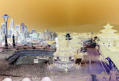
Kit Wise, KTM SEA MOW RUH, 2010
He created Nocturne, an installation creating a 360 degree cityscape at night, composed of around 500 images of cities at night, all from the internet.
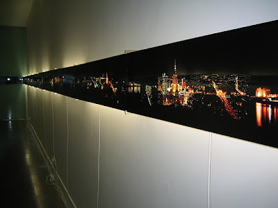
Nocturne, installation, 2003. 
Detail from Nocturne installation, 2003.


The idea of creating a digital or virtual world and what it conjures- illusions of space - is interesting to me. I think it would fit particularly well with the projection space we are working to at Horse Bazaar. I'll start sketching...

Thursday, 17 March 2011

Dr Lakra.

These works are by Mexican tattooist and artist, Dr Lakra.
Using the technique of altering found images, Dr Lakra has drawn intricate tattoo designs on old magazines and advertising material. I like them because they are kind of macabre but funny at the same time.


Amie Dicke.

We looked at Amie Dicke's work today, it really intrigued me. Firstly just aesthetically, then even more so after looking into the process she has used. For these works, Dicke has cut away and coloured fashion magazine images of models, to create faces and figures made of black webs of connecting lines: 


The process of cutting away from the original image is powerful here - the use of negative space is something I'll consider. So far I'd only been thinking about making an image by 'adding', but subtracting elements could be more interesting.